Brasserie de Woensberg
Brasserie de Woensberg came to us with the question: how do we create a recognizable, warm, and distinctive brand identity that reflects both the homely atmosphere and the unique location on the Woensberg?
2 concepts
To arrive at the right answer, we developed two different concepts:
- a natural, more rugged concept with organic shapes;
- a bolder, more refined concept with greater definition and sophistication.
After the presentation, the brasserie decisively chose the bolder concept — a style that aligns perfectly with their ambitions, target audience, and desired appearance.
This formed the foundation for a complete brand experience, from branding and logo development to social media, print materials, and the website.
Analysis of old design
Before developing new concepts, we first examined the existing design of Brasserie de Woensberg. The old design had a friendly but outdated look. Think of:
- Colors that didn’t match the natural surroundings or the warm atmosphere of the brasserie.
- Typography that was applied inconsistently and didn’t give the brand identity much character.
- Imagery that lacked atmosphere and therefore failed to convey the feeling of “coming home.”
- Print materials and online expressions that each had a different style, resulting in an inconsistent appearance.
Although the old design was functional, it lacked a clear, recognizable identity. It didn’t feel like a cohesive brand. The foundation was there, but it needed refinement, direction, and character. That insight became the starting point for the two new concepts — from which the bolder concept was ultimately chosen.
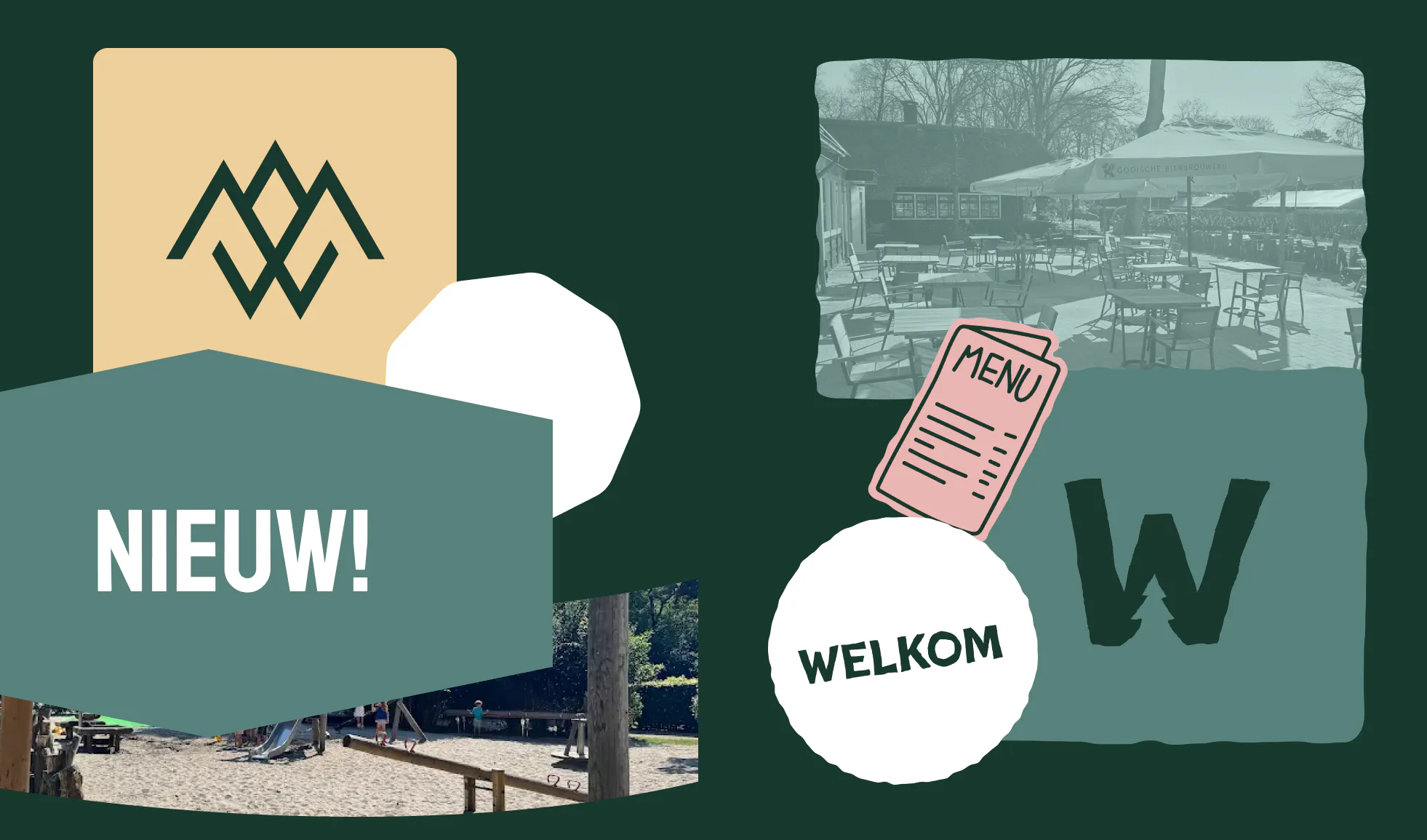
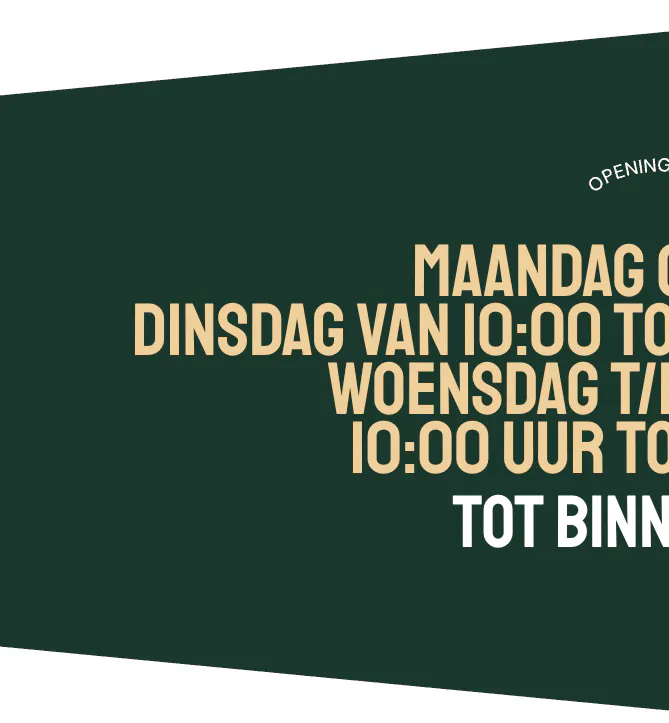
Branding & Identity
The chosen concept features a stylish, powerful look with warm accents. The color palette consists of deep greens and cream — a balance between bold and welcoming. The typography combines raw, handcrafted elements with modern refinement. Together, this creates a visual identity that is distinctive, characterful, and inviting.

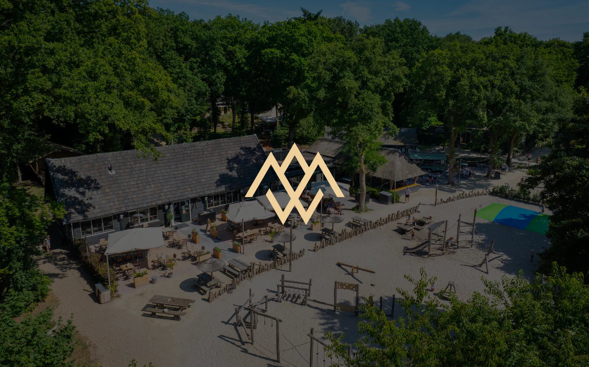
Logo
The logo has remained the same, but we started using it in a more powerful way — placing more emphasis on the symbol and its form. The shapes from the logo were carried through into the design of the overall visual style.
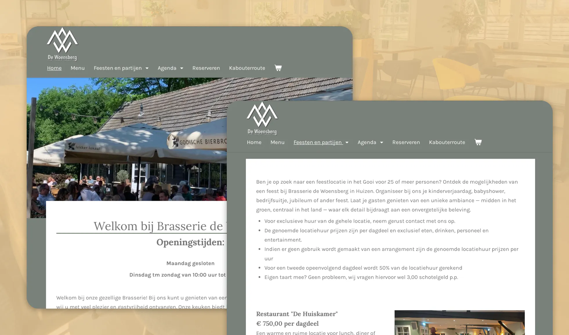
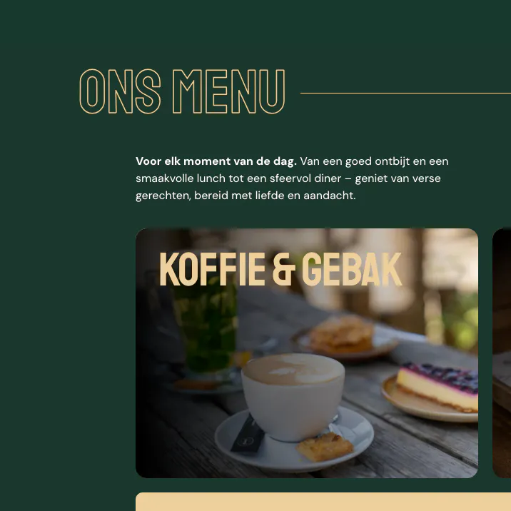
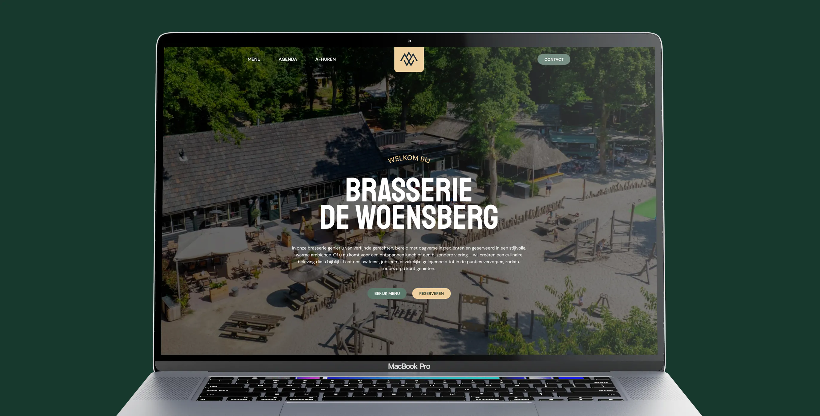
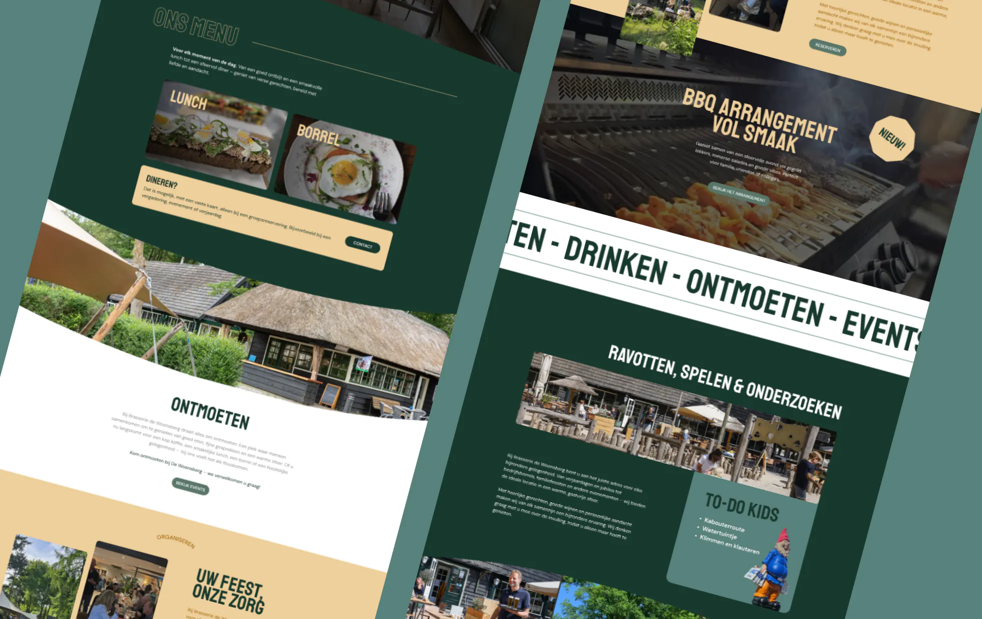
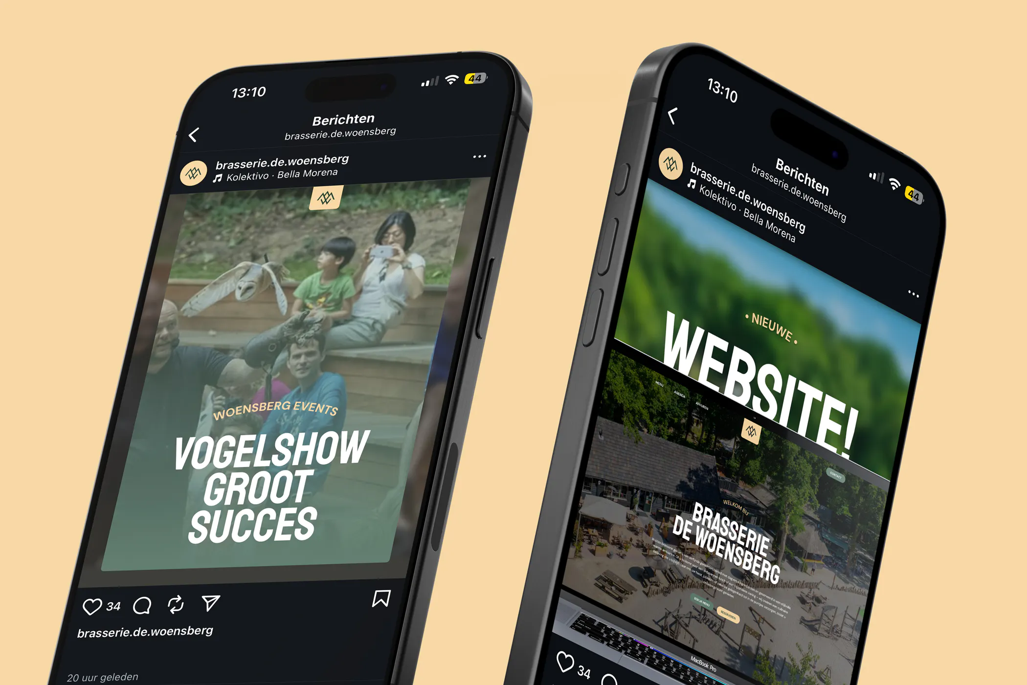
Website
The new website reflects the same atmosphere as the brasserie itself: warm, inviting, and easy to navigate. The homepage opens with a strong hero image, supported by clear call-to-actions such as “Reserve now.” The menu page is cleanly structured and optimized for ease of use. Everything is fully responsive and seamlessly aligned with the brand identity.
Social media
For Instagram, we developed a visual content strategy in which atmosphere, nature, dishes, and events come together. The bold, chic style is reflected in the image selection, typography, and tone of voice. Short, friendly captions create a personal and approachable feel, while posts such as “Sunday Jazz Hangout” or “Clearly Pizza’s” encourage interaction and brand recognition.
Conclusion
With the new bold concept, Brasserie de Woensberg has gained an identity that goes beyond design — it has become a complete experience. The look and feel are warm, welcoming, and full of character, both online and offline. From the moment you walk in, it feels like coming home.